Halliburton Drill Depth Reports
The UX Challenge
I was referred to Halliburton to assist in redesigning a selection of printable reports for their drilling equipment. Their current reports were not expandable and could not be shared by similar functioning teams. Not to mention they were pretty awful to look at.
The UX Approach
Despite the complexity of the required output, this was a very simple user centered approach. I met with the project sponsors to understand where their major frustrations were and to do my best to understand the data points and what they represent.
Largely a visual design project, there was still need to distill what the most important data points were and create hierarchy of priority.
The Final Product
What I helped the company settle on is a clean, easy to understand, and visually appealing record of drill activity with modular components that can be reused.
The UX Impact
TIME and MONEY. For a company the size of Halliburton, having reusable components that can be shared to different functioning areas can easily translate to savings in the hundreds of millions of dollars, and hundreds of thousands of man hours. No need to create custom components for each print type. No need for additional training on their use.

The main overview page
This is a report meant to be printed. We decided on an “at-a-glance” overview page that would be at the top of the page stack to give a snapshot of remainder of the report. The inclusion of the map was something I presented that the team had not considered but loved enough to pursue suitable APIs to implement.
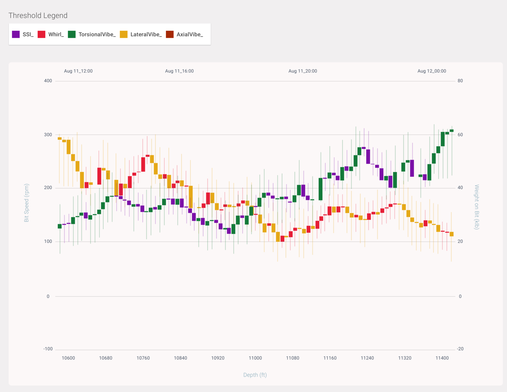
Chart design to catalog drill dysfunctions, as well as drill depth and magnitude.
I had the idea to use this candlestick design (borrowed from my experience in cryptocurrency design and FinTech) to show the fluctuations in drill intensity.
A good idea, but ultimately not used.
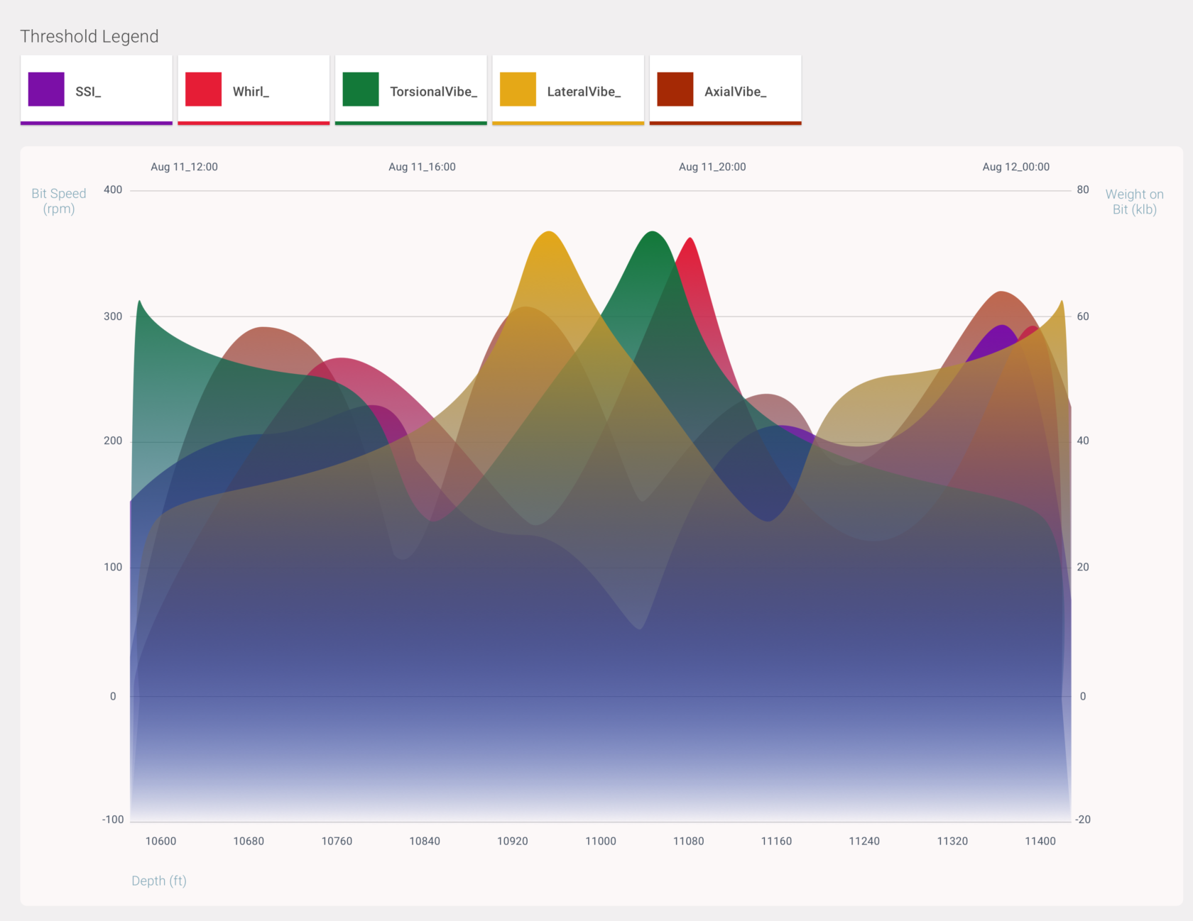
Alternate view of drill dysfunction, depth, and magnitude.
This is the view that was implemented. According to the team, the changes in depth and magnitude are actually not so gradual as the chart implies, but loved the idea of superimposing the data points.

A heatmap of the dysfunction relationships.
This view took several revisions to settle on. Even this one that was finally approved still gives me some pause from an accessibility standpoint. I did urge them to ultimately settle on better contrasting colors (these were from their in-house visual designer). Halliburton has a range of allowances they can work within regarding branding, reporting, and ADA. They assured me this was within range.